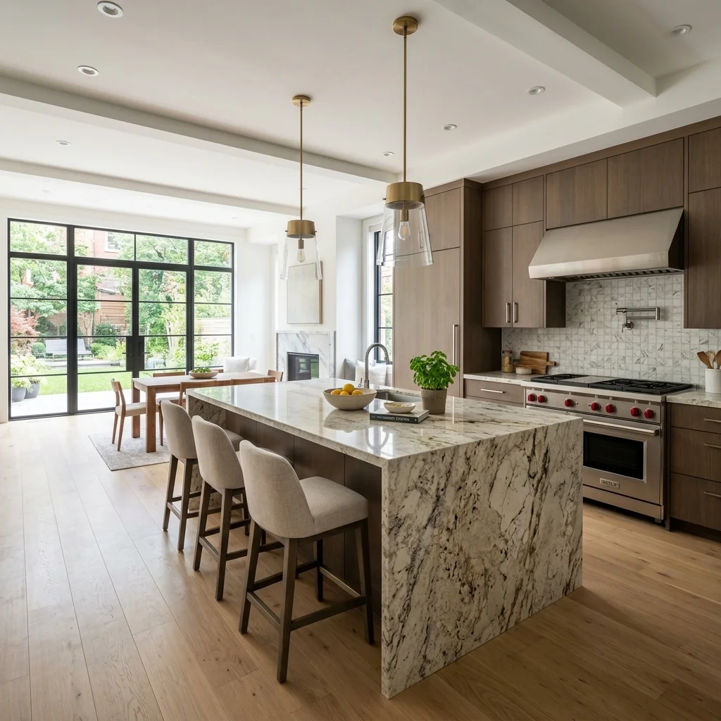
Over 60% of all local searches happen on a smartphone. If your website is difficult to navigate on a mobile device, you are actively driving customers away. We build responsive, mobile-first layouts that function flawlessly on every screen size, ensuring your Los Angeles business is presented perfectly to users on the go.
Tell us about your business and a Los Angeles-based designer will follow up within one business day.
A truly mobile-friendly layout requires a complete rethinking of how users interact with content when using a touchscreen. It is not just about shrinking a desktop site down to fit a smaller screen.
In Los Angeles, customers often search for emergency services, contractors, and local businesses while they are out and about. If they arrive on your site and have to pinch and zoom just to read your phone number or find your contact form, they will leave immediately. We prioritize tap targets, highly legible font sizes, and streamlined mobile navigation to create a completely frictionless experience.
Furthermore, Google now uses mobile-first indexing. This means the search engine evaluates the mobile version of your site to determine your rankings. If your site is not fully optimized for smartphones, your desktop rankings will suffer as well. Our responsive architectures ensure that your website adapts and reshapes itself intelligently, delivering a premium experience whether viewed on an iPhone, an iPad, or a massive desktop monitor.
| Feature | Custom | Template |
|---|---|---|
| Unique Design | ✅ | ❌ |
| Brand Identity Match | ✅ | ❌ |
| Page Speed Optimized | ✅ | ⚠️ |
| SEO-First Architecture | ✅ | ⚠️ |
| Conversion Focused | ✅ | ❌ |
| Scalable & Flexible | ✅ | ⚠️ |
| Full Code Ownership | ✅ | ❌ |
| Ongoing Support | ✅ | ❌ |
We implement specific design features to ensure your site is easy to navigate with a thumb on a small screen.
Your website automatically adapts, scales, and reshapes its layout to perfectly fit smartphones, tablets, and desktop monitors seamlessly.
Buttons, links, and forms are sized appropriately and spaced out to prevent frustrating mis-taps on small touchscreens.
We make it incredibly easy for mobile users to contact you by integrating prominent, single-tap phone number links.
Font sizes, line heights, and contrast ratios are strictly controlled to ensure high legibility without the need for manual zooming.
Complex desktop navigation is intelligently converted into intuitive "hamburger" mobile menus that are easy to access and dismiss.
Mobile cellular connections can be slower than Wi-Fi. We optimize assets specifically to ensure fast loading on 4G and 5G networks.

Instead of maintaining a separate "m.website.com", a responsive design uses a single codebase that adapts to all devices, cutting your maintenance time in half.
With a single URL structure, all your backlinks and SEO authority are consolidated, giving you significantly stronger ranking power on Google.
Users get the exact same high-quality brand experience whether they look you up on their work computer or their personal smartphone.
Responsive design relies on flexible grids, meaning your website will automatically look great on new devices and screen sizes released in the future.
When you need to update a service description or change a price, you only have to do it once. The changes reflect across all device views instantly.
We work with residential, commercial, and industrial contractors of all sizes across the trades.
Do not let a frustrating mobile experience cost you leads. Contact us today to build a beautifully responsive website for your Los Angeles business.